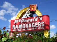
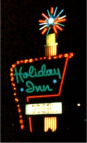
Know something I miss from the ’70s? Huge, tacky, landscape-dominating, power-sucking, neon-laden, animated signs. They’re not products of the ’70s, of course–they date to the post-World War II era, when it was just becoming possible to drive coast to coast with relative ease. But the ’70s were the last time they were around in any numbers.
 They’re all but extinct now, sacrificed on the altars of sign ordinances, energy conservation, and just plain good taste. But there are still a few stalwarts, even in and around Huntsville. The McDonald’s on the Parkway near Drake has an old neon sign with Speedee on it. The Curry Motor Co. sign on Jordan Lane was operational as late as the early ’90s.
There’s a bank in Pulaski, Tennessee that has an operational spinning sign–you know, the sort that completes a revolution every 15 seconds or so. It’s a strange, strange sight in 2007. I hope they keep it running, because I enjoy it every time I drive by it. If you see those at all anymore, they’re usually unplugged, and the substantial OCD streak in me always flares a bit when they’ve left it a little bit off square.
Of course, the king of this realm is the old Holiday Inn “Great Sign.” To me, this is as much an American icon as the Coca-Cola logo or the Chevrolet bowtie. It’s about the size of a football field in my childhood memory, but I’d guess it was “only” about 50 feet tall. When I was little, there was one in Oxford right near I-20 that I stared at every time Mom or Dad drove by. It was also my signal that we were almost home at the end of a long trip.
 Part of me misses the visual overload of these signs, but they represented something deeper than that too. They were outward expressions of a nation in exuberant love with the newfound freedom afforded by the dawn of the reliable, robust, affordable automobile–a construct that is only 60 or so years old, if you think about it.
I suppose the current arena for that kind of energy is the World Wide Web. But for all the good embodied in the realization of McLuhan’s “global village,” which the Web most certainly is in my view, there’s a crushing crassness about it. With the ease of self-publishing and the constant information assault, we get to “been there, done that” way sooner than we used to. It takes more and more to impress us. Consequently too many of us walk around with a subtle scowl as our default expression, and we mentally engage with our attitude needles already pegged on “so what?”
It saddens me to consider that the culture of wonder that produced these magnificent signs might not come around again. Commercial spaceflight might be the best chance for it in my lifetime.
Thanks to icaryn.com for the McDonald’s sign image and answers.com for the Holiday Inn sign image.
You might also like:
- Downhill ever since Hamburglar started talking
Our pastor mentioned McDonald’s this morning as part of a larger point about how thoroughly children… - Bo Williams, driving instructor
My older son got his learner’s permit today. I remember very well him crinkling his nose at me and c… - The meat-and-three
I talked with a friend today about the concept of the meat-and-three restaurant. I can eat at a meat… - RIP, Consumer Information Catalog
When I was a tot, I thought getting mail was just about the coolest thing in the world. I guess prob… - The five-dollar trip to nowhere
Driving over the hill into Jones Valley the other day, I chuckled remembering that in high school, C…

You know – I believe I remember a time in FL growing up where they were pretty much outlawed as a distraction to drivers. There’s a car dearership that had this awasome rotating spiked gloge with all the spikes being different colors – they still have it – they just can’t rotate it. Bummer. I really like them too – but I’m a big sign/graphics person. If I ever go to Las Vegas I plan on taking tons of photos of their cool signs – Vegas seems to be the last stand in flashing and glowing.
I always liked the over-sized animals used for advertising, too! Like the steak places that had the huge bull or the Ford places with the huge white Mustang. You never really wanted to park under those things, though, just in case it was that precise moment when the bolts securing it to the pole decide to spontaneously combust. At any rate, you don’t see those much anymore, either.