It’s pretty hard to find a carburetor in a new car anymore. Outside the third world, it may be impossible.
Nevertheless, I know a lot of us are old enough to remember the drill. For a cold start, pump the accelerator once, take your foot off, and turn the key. Most of the time that’s all you need to do. (If it’s a Ford with a 351 Windsor of some age, wait three seconds for it to quit. Then, turn the key again.) The only common mistake you could make was flooding it—too much fuel in the carburetor at once. Wait a few minutes and try again. Or, press the accelerator all the way to the floor and crank for ten seconds at a time, waiting thirty in between, until it starts.
It’s extremely likely now that anything you drive day to day is equipped with electronically-controlled fuel injection. Turn the key (or press the button). Done.
Carburetors worked pretty well. Fuel injection works essentially flawlessly, and brings benefits like increased efficiency, smoother delivery, and near-perfect reliability. It is better in every way. Consequently, you’ll never hear anyone say anything like “my new $35,000 Honda is pretty nice, but sheesh, I just wish it had a carburetor.”
Yet those of you still whining about the Windows 8 Start screen sound pretty much like that.
Be honest—have you even tried to use it? Or have you rejected it out of hand because ewww gross it’s different?
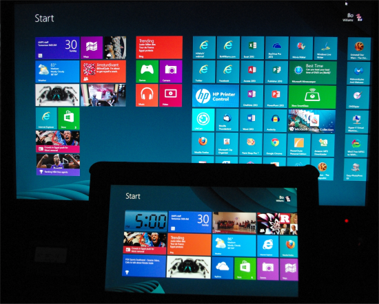 Yes, it is different. It’s better. I love it. I love the organization options. I love the live tiles. I love how easy it is to replicate my layout on multiple machines, optimizing this for desktop and that for tablet. I love the standardization it brings to things like application settings. It is classic bigger-better-faster-more. There’s nothing I prefer about the old paradigm.
Take some time with it. Think of it as an extended Start menu—what appears in Windows 8 when you click the Start button. (That’s exactly what it is. Think about it.) Open your mind to this new experience. Use it on its own terms—as it’s intended to be used.
You’ll love it in three days.
You might also like:
- Think of Windows 11 as Windows 10.1, and it’ll meet expectations
Windows 7 to Windows 8 was a big jump. Windows 8/8.1 to Windows 10 was a pretty good-sized jump too…. - A few days with Windows 8
A few observations since I went (mostly) all in with Windows 8 at home: I love the SkyDrive integrat… - Back to Bridge Street
Well, I’m going back to our latest Peoplequarium today. Julie, a bud who shows up in six-month stint… - Interface designers, make setup easy, but then hide it!
Whether it’s software, portable electronics, or whatever: interface designers, during normal operati… - Post office regresses on self-service efficiency
Stopped by the Madison post office today to get stamps. I usually handle this online, but forgetting…
Jeff installed windows 8 on our home desktop about 3 months ago. I loathe it with a passion normally reserved for Disney Channel tween sticoms. I’ve given it a chance. I have tried to work with it. I hate it. Hate. Hate. Hate.
I can’t find anything. I find myself floundering around looking for a picture or a file or a program…nothing makes any sense.
I usually just end up with the desktop pulled up and doing any work I need to do from there. (except, inexplicably, I am still sometimes flung back to the whole live tiles thing) And I’m not alone out there. I am breathlessly awaiting 8.1, where I’m told many user-friendly changes are coming.
My issue with Windows 8 is somewhat similar to what you’ve described. It’s not that I don’t like the new start screen, I just think it’s only half baked:
There’s all too many options and settings in Windows that you still effectively have to go back to the desktop to get to. Go open up the Control Panel on a Windows 7 (or Windows 8 machine) and count how many icons there are. Bear in mind that within many of these options, there are numerous layers/tabs of settings to be configured.
Now compare that to the listing of options to the “Settings” option from the slide out bar on the right of the start screen. It’s vastly slimmer options.
Now this would be ok if there was an easier way to get to all of this stuff, but I have a hard time getting to it. By that I mean, it takes more clicks than it used to. That may seem like a silly and superficial complaint… but when everything has 2 or 3 extra clicks with a gesture to a particular portion of the screen added on top of the process I want… and from that point, the actual process is exactly the same as it was in Windows 7… what has that start screen really gotten me?
It makes some things really easy to get to, while it just adds an extra layer of interface that you effectively have to tell to “get out of the way” for everything that didn’t get integrated.
That, is why I want the start menu back.
Now I’ll admit, my overall experience with Windows 8 has been limited. I’m sure there’s some way to simplify some of this, but I’ve honestly not had the chance to research it. Unfortunately, I don’t have the time to tinker with it, nor a computer that can be enjoyably used with Windows 8 at the moment, and I just don’t have the will to try too hard to resolve that at the moment either.